ROLE
UX/UI Designer
CLIENT
Personal project
PLATTFORMS
Mobile
Lieferando
PROBLEM
Even tho the app is used weekly or even daily. The ordering process has some ux pain points that creates frustrations of users while looking in the restaurants menu or to re-order previous food.
SOLUTION
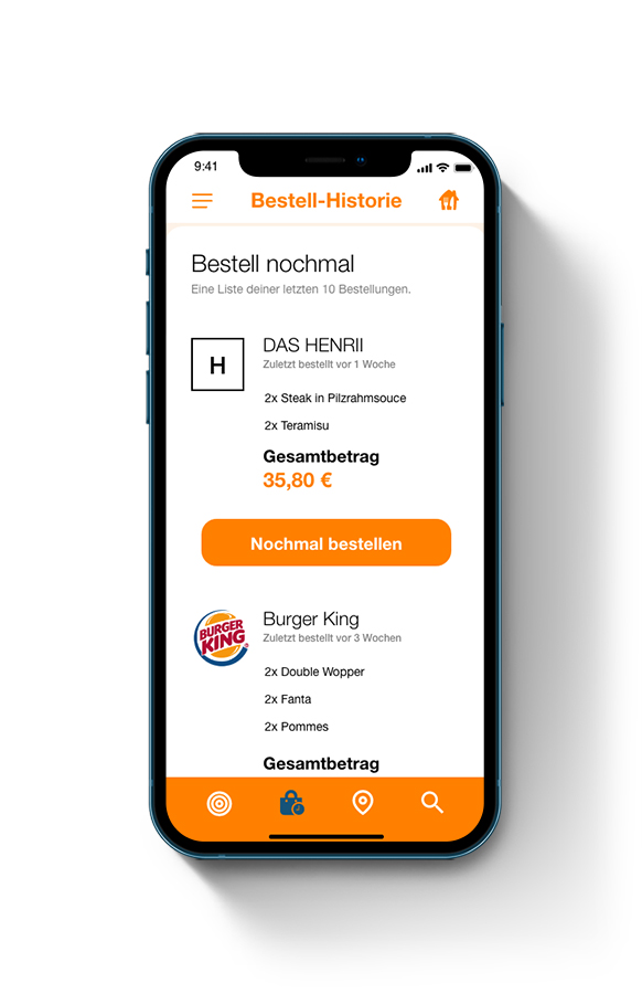
Objective was to improve the ordering user flow in a trusty, flexible and easy to understand way increase ordering within the app. Also giving the pre-ordered food a new location within the app because people thending to reorder food they liked before.
PROCESS
- Qualitative user research with selective user interviews to find the current pain points and understand the problem
- Flow analysis and user interviews to find possibilities to improve the pain points
- Wireframe/Low fidelity designs to test solutions
- Final design creation with implimented improvements
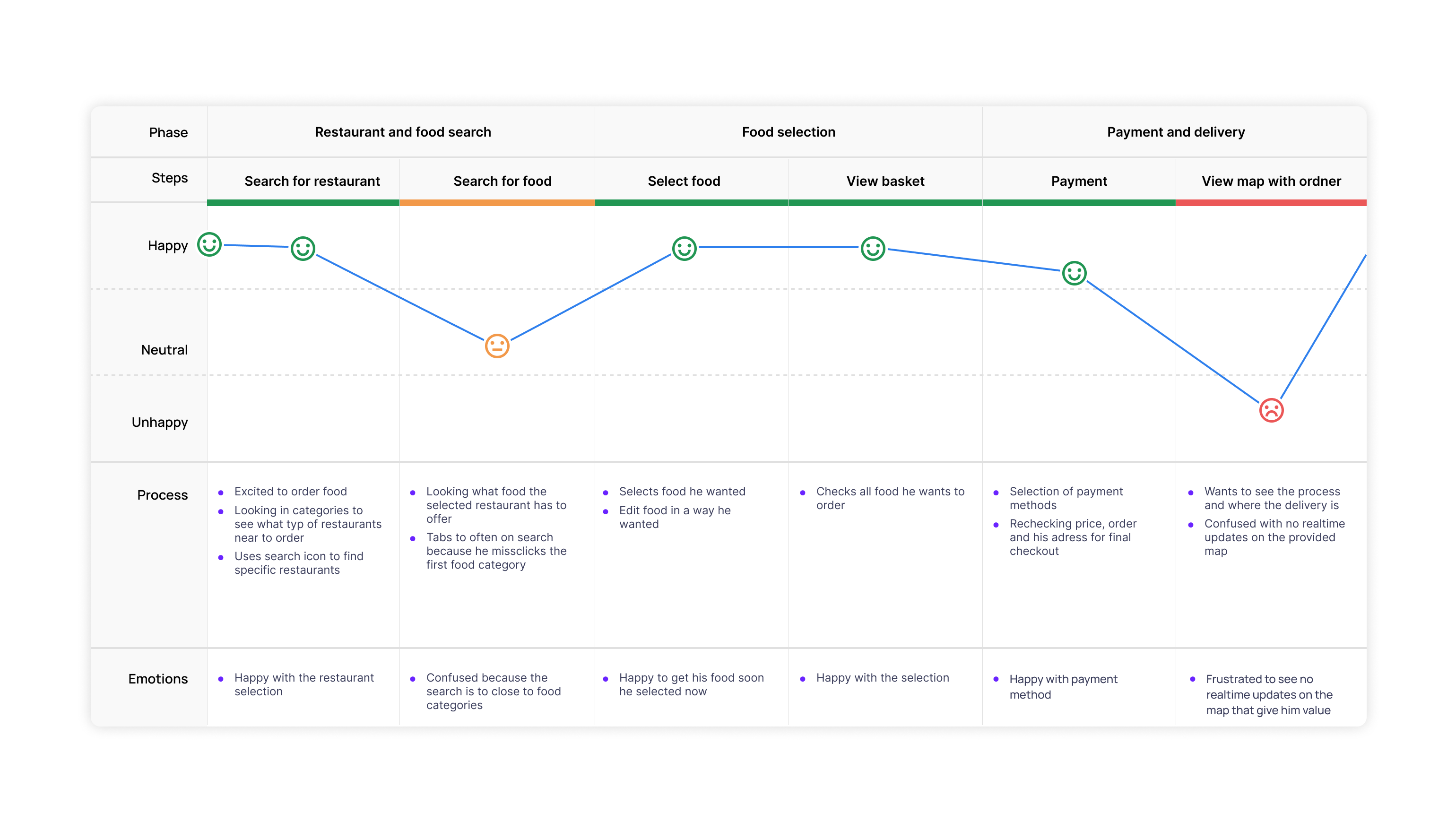
QUALITATIVE USER RESEARCH
Even tho the app is used weekly or even daily. The ordering process has some ux pain points that creates frustrations of users while looking in the restaurants menu or to re-order previous food.
USER INTERVIEW & USER JOURNEY MAP
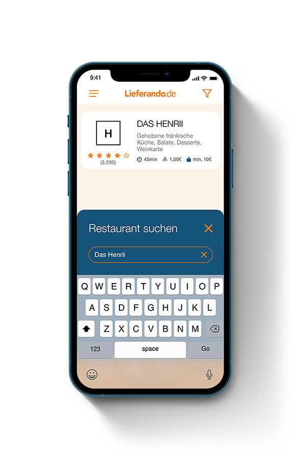
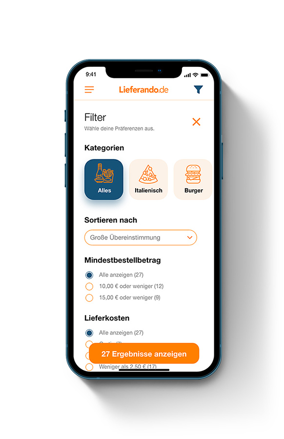
Finding the key painpoints in the food selection
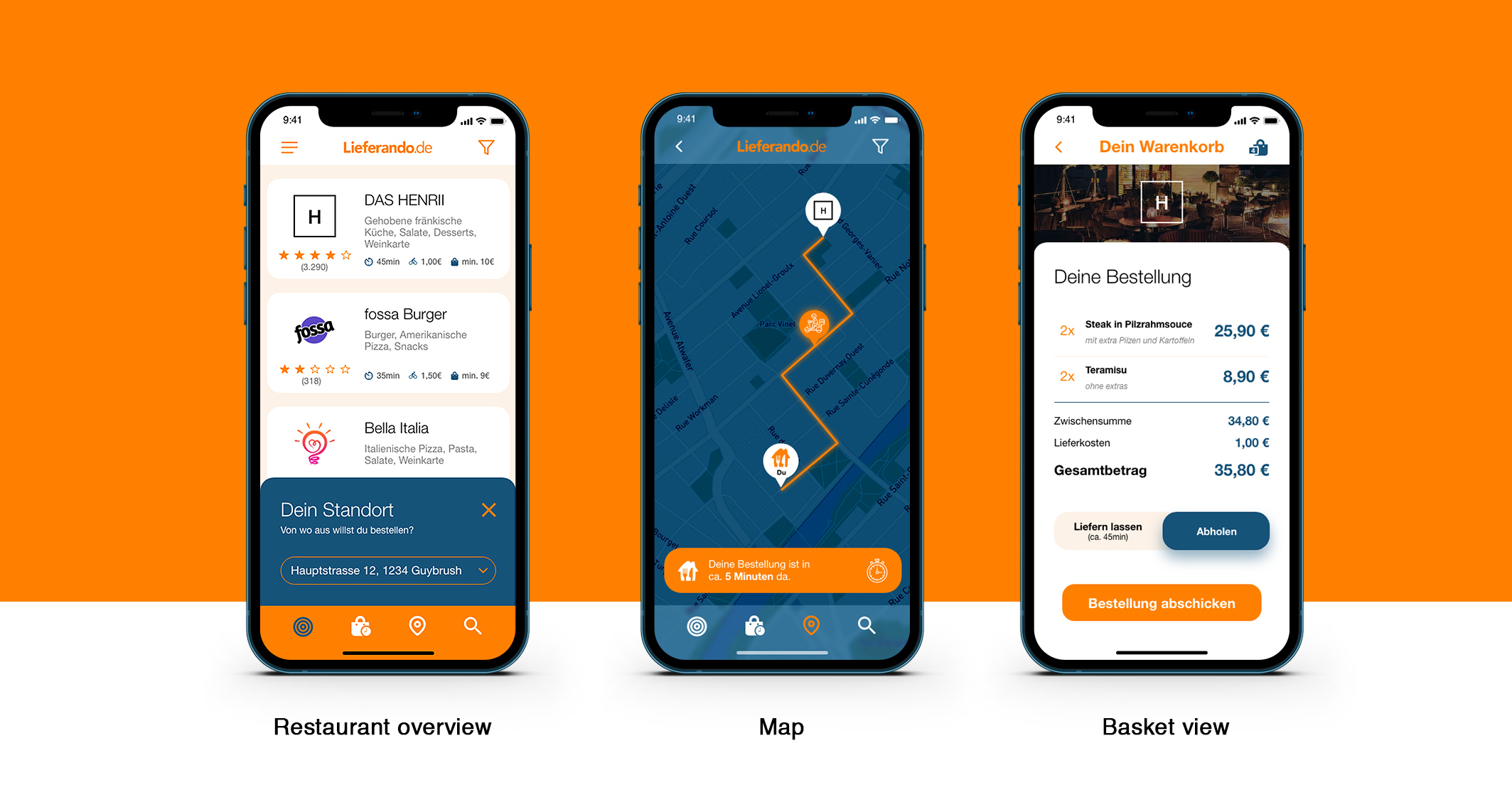
At first comes the user research following with interviews that showcase the painpoints in the ordering process. Tony found out that selection in the categories and the food selection creating frustrations in the user. Because specific buttons and features are placed in the wrong locations. For example the placement of the food search inside the restaurant details page created frustrations. Because the users tending to miss-clicking on it when quickly browsing the food selection. Another example was the adress placement on top of the food categories available around the location.
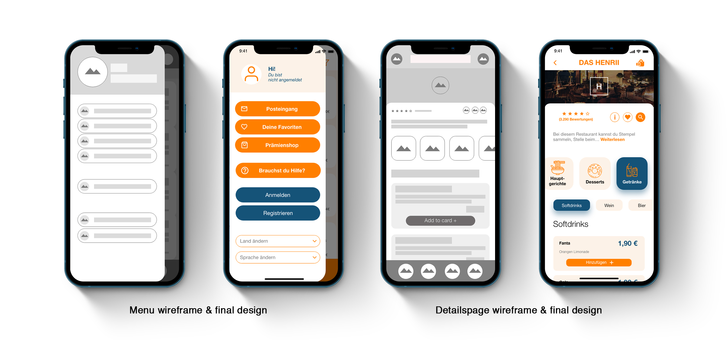
WIREFRAMING
Bringing in a "day one" design thinking method
The interviews and user research brought in new pain points. With that process, Tony started with the 6 step design thinking method by first hearing and interviewing users that use the Lieferando app on a regular basis.

THE OVER-
VIEW
More appealing overview with branded elements
Medi.net was concepted to be a tablet first intranet. People in hospitals should be able to get the information on the fly and tablets are the perfect medium that combines information dencity and mobility for the user. It also gives the possibility to add other hardware like little mobile headphones to have quick calls with colleaques.
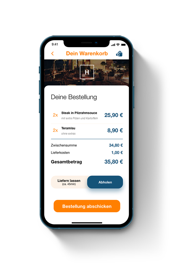
DETAILS-
PAGE
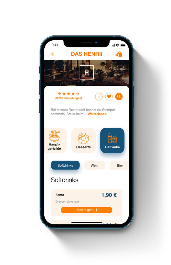
Find faster and more efficient the food you want
As a key element, the restaurant detailspage got a new structure that is split down into main and sub categories to help the user filtering the food quicker. Because often the user knows what he has for behavours before ordering the food even when he didn't exactly know what food he wants. But he knows if he wants a warm or cold starter, a burger or pizza or a aloholic and non alcoholic drink. Also the new structure helps the shrink down the scrolling in the app because every food is well structured in the menu.

LEARNINGS
Before UI comes always the UX
It's easy to find better solutions and ways for a more appealing design when it comes to shapes and colors. User experience is the base of the decisions that went into the user interface design (UI). A great experience helps users to enjoy the time they want to spend on a software. Even when it's just 5 minutes or less to order food. A great design and experience always comes when the user integrated early in the process.
Tony Andreas Rudolph
UX & VFX Storyteller
zulusplitter@online.de
+49 16090197007
Legal notice Privacy policy